

Rebranding FCS Community Management to HOA Living
FCS Community Management had built a strong reputation in the property management space, but its brand no longer reflected the company’s evolving vision or the full breadth of its services. With growing portfolios in residential neighborhoods, townhomes, and commercial properties, the FCS name and visuals felt outdated and disconnected from their modern clientele. The company needed a rebrand that would better communicate its purpose, professionalism, and people-first approach.
Objective
To create a new identity that:
Reflects a modern, community-focused brand
Represents the diversity of properties managed (residential, townhomes, commercial)
Feels professional, approachable, and trustworthy
Can scale with future growth
Strategy & Execution
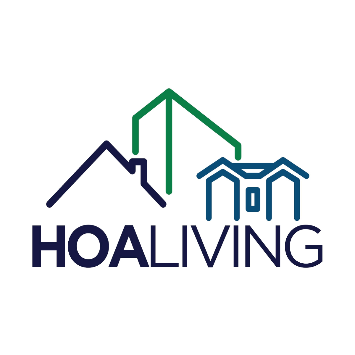
We began with a brand audit and stakeholder discovery sessions to define the company’s core values, audience expectations, and long-term vision. The result was a new name: HOA Living—a clean, memorable, and market-relevant shift that emphasized the organization’s focus on enhancing the lifestyle experience within HOAs and managed communities.
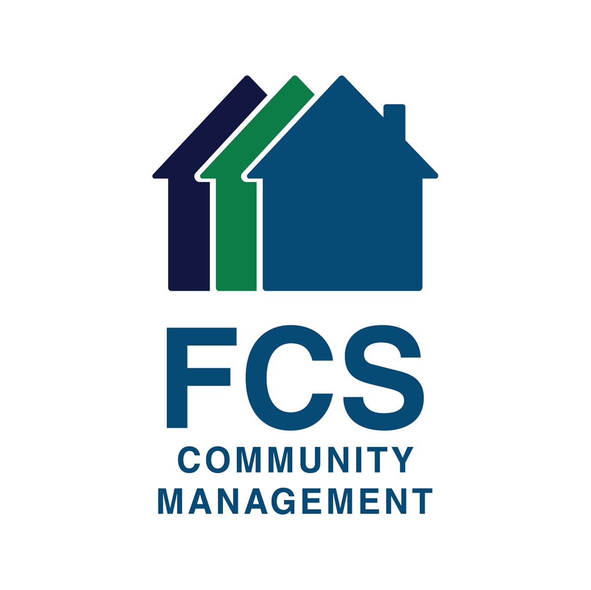
I developed a new visual identity and logo system that symbolizes structure, unity, and livability. The final logo integrates subtle architectural elements to represent the three key segments: homes, townhomes, and commercial buildings. The design was crafted to be versatile across signage, digital platforms, and branded materials—delivering both form and function.
Before
after
The Conclusion
The rebranding of FCS Community Management to HOA Living marked a pivotal shift for the company—aligning its name, logo, and messaging with the communities it serves. This strategic refresh helped the brand better communicate its mission, stand out from competitors, and position itself for long-term growth.